Quality is the most important factor in the business world, where efficiency and excellence are highly valued. Today's businesses need the appropriate tools to protect against flaws and maintain high standards, similar to how samurai used to do in the past. Introducing the "7 Warriors of Quality" a collection of straightforward but effective instruments that can overhaul your quality control procedures and assist you in tackling imperfections with accuracy and skill.
Kaoru Ishikawa, a Japanese engineering professor, created the seven quality tools (also known as the 7 QC tools) in the 1950s to assist workers with different technical expertise in enforcing successful quality control methods. At that moment, workers without technical backgrounds found training programs in statistical quality control to be complicated and daunting. This hindered the standardization of efficient quality control throughout operations. Businesses discovered that by simplifying training to basic and user-friendly principles, such as the seven quality tools, they achieved improved performance on a larger scale. Today, these tools for managing quality are still regarded as the best method for diagnosing various quality problems. They are often used alongside popular process improvement methods such as Six Sigma, TQM, continuous improvement processes, and Lean management.
1.Cause-and-Effect Diagram (Ishikawa/Fishbone Diagram)
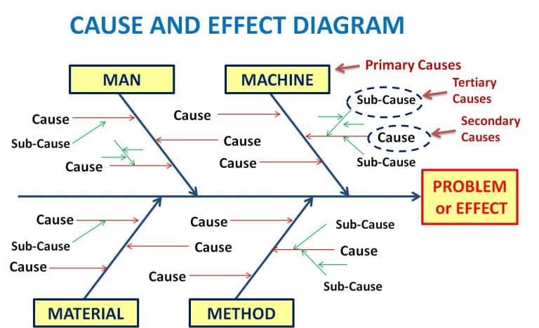
The Fishbone Diagram, also called the Cause and Effect Diagram, assists in analyzing the possible causes of a problem or an effect. This tool assists in pinpointing the underlying reasons for issues, cutting through distractions to uncover the actual factors impacting quality. Besides organizing thoughts into specific groups, it also aids in identifying potential areas for improvement by engaging in productive brainstorming. Fishbone training helps you pinpoint the possible root cause of the issue. This tool, named after a fishbone, operates by outlining a quality issue on the right side of the diagram, with specific root causes and sub-causes branching out to the left. An instance is when a large car manufacturer utilized the Fishbone Diagram to address a reoccurring problem with imperfections in the paint. By pinpointing the inconsistent spray pressure as the main issue, they managed to streamline the process and decrease defects by 30%.
2.Check Sheet
Check sheets are useful for gathering either quantitative or qualitative information. When utilized for gathering quantitative data, they can be referred to as a tally sheet. A check sheet compiles data through check marks or tally marks showing the frequency of a certain value, helping identify defects, patterns, and causes efficiently. Check sheets simplify the process of recording initial frequency distribution data for process measurement with their straightforward setup and clear graphics. This specific visual can serve as an initial data-gathering instrument for constructing histograms, bar graphs, and other analytical tools. This basic instrument allowed them to lower defects by 25% in half a year, demonstrating the effectiveness of precise data gathering.
3.Control Chart
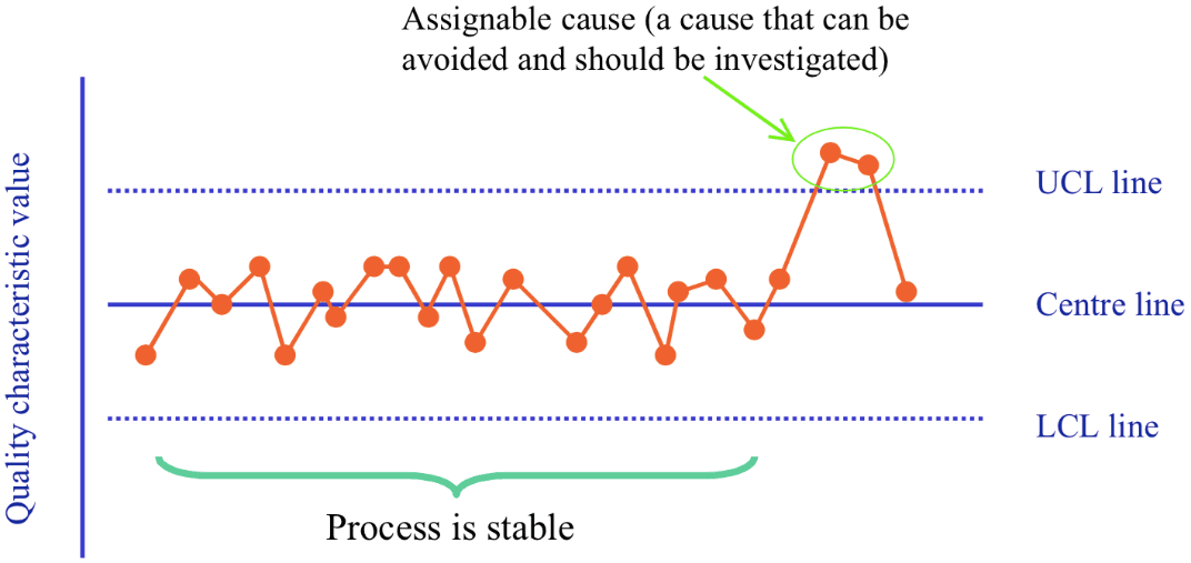
Control charts are used to analyze the evolution of processes over a specific timeframe. Named in honor of Walter A. Shewhart, this tool tracks changes in process variation, allowing you to identify any deviations that may result in defects. Utilizing a control chart can help your organization save time and money by forecasting process performance, especially in meeting the expectations of your customer or organization for the end product. In one example, a food processing company employed Control Charts to oversee the fill levels of their packaging machines. This resulted in a 20% decrease in underfilled packages, guaranteeing consistent product quality for their clientele.
4.Histogram
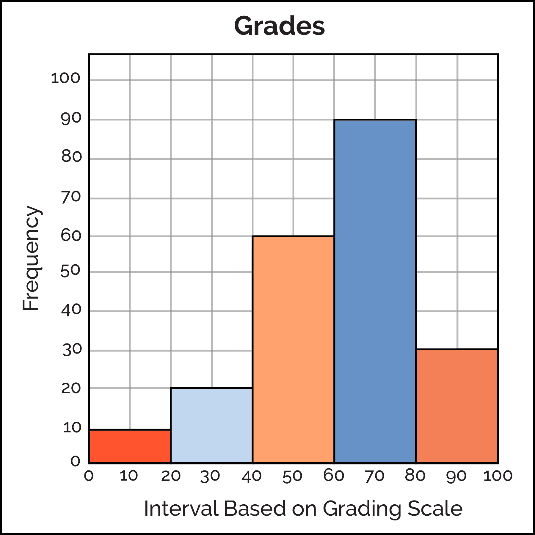
A histogram is a graph frequently utilized to display data distribution and frequency, aiding in the distinction of occurrence of individual values within a dataset. Understanding quality problems is essential and the Histogram is your key tool for gaining insights into your data. By examining the form and distribution of your data, you can effectively decide on enhancements in procedures and avoid defects. A pharmaceutical company used Histograms to examine tablet weights and discovered a variation that was leading to insufficient dosages. By modifying their blending technique, they were able to enhance weight uniformity by 15%.
5.Pareto Chart
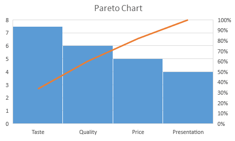
Pareto Chart is based on the 80/20 rule where it shows the significant factors that have the highest impact on the identified problem. In the heat of battle, knowing where to focus your efforts can make all the difference. The Pareto Chart is your bow, helping you prioritize issues based on their impact. A combination of a bar and line graph, the Pareto chart depicts individual values in descending order using bars, while the cumulative total is represented by the line. The goal of the Pareto chart is to highlight the relative importance of a variety of parameters, allowing you to identify and focus your efforts on the factors with the biggest impact on a specific part of a process or system. In the aerospace industry, a manufacturer used Pareto Charts to identify that 80% of their quality issues were caused by just 20% of their suppliers. By focusing on these key suppliers, they were able to reduce overall defects by 40%.
6.Scatter Diagram
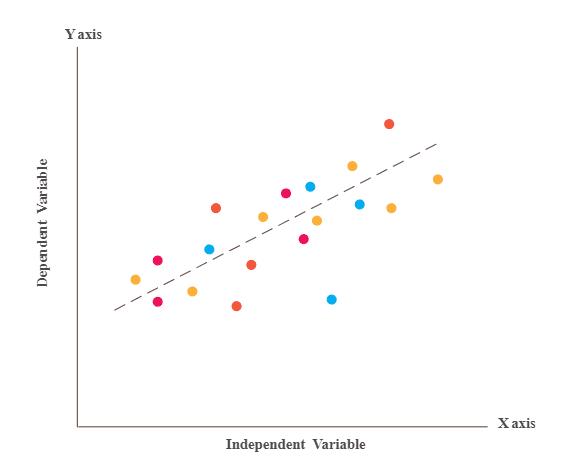
Quality assurance professionals find the scatter diagram most beneficial for illustrating the connection between two variables and identifying cause and effect relationships. Each dot on the graph represents a shared point where the Y-axis values depend on the X-axis values. Connecting these dots can emphasize the correlation between the two factors. The more a diagram shows correlation, the more it indicates a strong relationship between variables. Scatter plots are beneficial for quality control by showing connections between quality issues and factors like surroundings, tasks, employees, and more. After identifying the connection between a specific issue and its root cause, targeted solutions can be applied for improved results. By examining these connections, you can make specific changes to procedures and avoid problems in advance. A semiconductor producer utilized Scatter Diagrams to identify a link between changes in temperature within their clean rooms and rates of defects. By stabilizing the temperature, they decreased defects by 35%.
7.Stratification
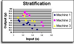
Stratification analysis is a method of quality control that categorizes data, objects, and individuals into different groups for evaluation. This is also known as Run Chart or Flow Chart. Stratifying your data can assist in uncovering patterns that may be difficult to see when it is grouped together. Stratification analysis helps you understand your data across different categories such as equipment, products, shifts, materials, or days of the week, both before, during, and after data collection. For optimal results from the stratification process, take into account how the information from your data sources can impact the outcome of your data analysis. Ensure that your data collection is arranged to incorporate that data.
Advantages of 7QC Tools:
- It offers a structured approach to problem-solving and enhancing quality.
- Simple to comprehend and put into action while being highly impactful
- A systematic and rational method for addressing issues
- Abide by the 80/20 principle where 80% of results come from 20% of efforts.
- Enhance the standard of products and services.
- Aids in recognizing and evaluating issues that arise throughout the process.
- Fishbone training helps with identifying the underlying causes of issues and finding solutions.
- Promotes camaraderie among team members and cultivates a positive work environment.
- Identifying the root cause and addressing it permanently.
- Improve customer experience and increase customer satisfaction
